As interior design trends shift toward “warm minimalism” and environmental resonance, Canadian homeowners are reimagining their spaces for winter. Thoughtful winter home colour palettes, inspired by the Boreal Forest, Aurora skies, and Prairie sunsets, now set the stage for interiors that are both modern and deeply connected to nature.
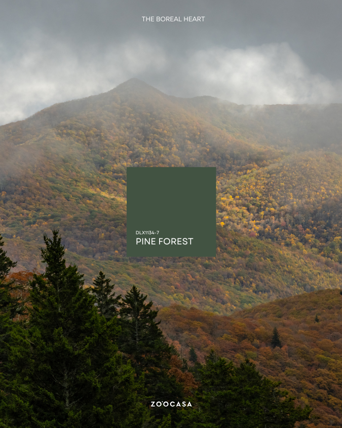
The Boreal Heart: Evergreen & Earthy Hues
Canada’s Boreal Forest, stretching coast to coast from Newfoundland to the Yukon, inspires cozy and natural winter interiors. With deep greens and textured browns, its palette reflects a “resilient spirit,” helping to anchor a home through the winter months.
Dulux’s Pine Forest (DLX1134-7), the Canadian Colour of the Year 2026, combines beautifully with warm browns and honeyed neutrals to create cozy, inviting spaces for gathering.
Designers recommend combining soft textures like velvet or bouclé with crisp white trim or built-ins. This approach softens low winter light and keeps deep colors feeling cozy and restorative.
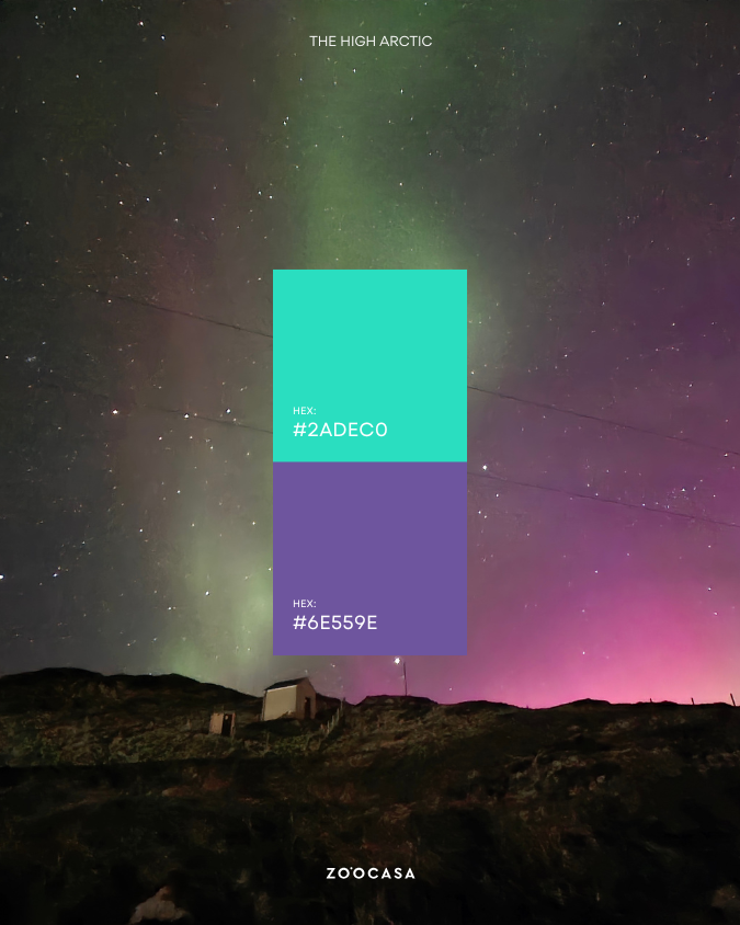
The High Arctic
Inspired by the High Arctic and the Aurora Borealis, this palette mixes intense purples, electric blues, and glowing greens for a dramatic effect.
Shades like Celestial Green (#2adec0) and Passion Flower (#6e559e) work well in media or game rooms, creating a mystical, protective vibe. Consider adding mirrors and reflective finishes that mimic starlight, making rooms feel deeper and more emotionally engaging.
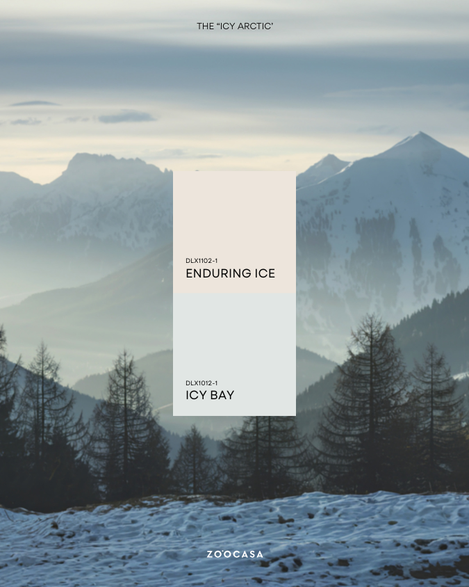
Glacial Whites and the “Icy Arctic” Aesthetic
Complementing these vibrant tones are glacial whites inspired by snow-covered peaks and frozen shorelines. Enduring Ice (DLX1102-1) and Icy Bay (DLX1012-1) offer soft warmth, avoiding the coldness of pure white.
Paired with natural materials such as wood, stone, and linen, these hues foster a dreamlike atmosphere that mirrors Canada’s winter landscapes.
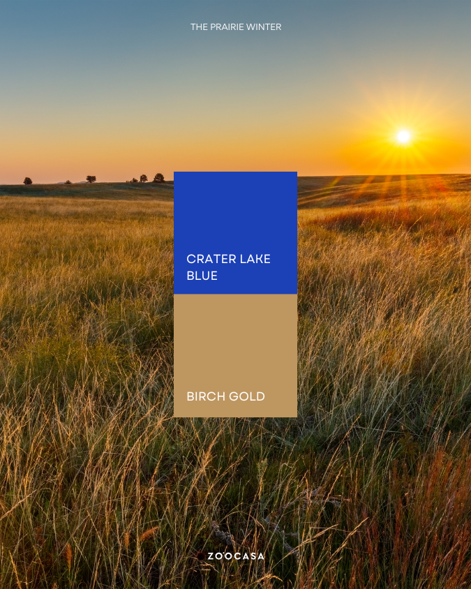
The Prairie Winter: Tonal Neutrals & Harvest Hues
The Prairies contribute a palette rooted in tonal neutrals, muted blues, and warm golds. Colours like Crater Lake Blue and Birch Gold balance cool and warm tones, creating spaces that feel fresh yet cozy.
Texture is essential in these spaces; layering materials such as wicker, velvet, and reclaimed wood adds dimension to neutral interiors while preserving a connection to the region’s agricultural heritage.
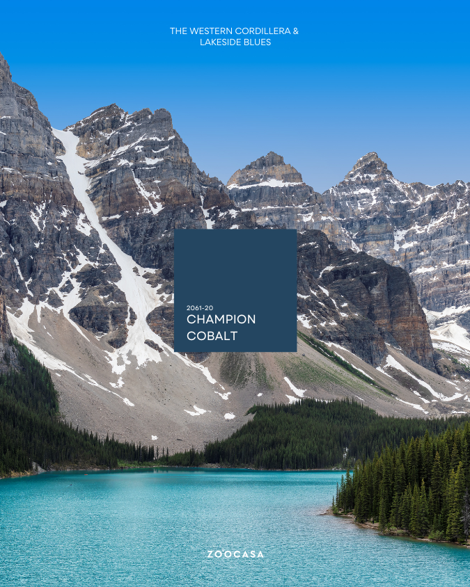
The Western Cordillera and Lakeside Blues
Colours drawn from the Canadian Rockies and Western Cordillera mix glacial blues, stone neutrals, and warm wood accents for a grounded look. The Rocky Mountain palette from Benjamin Moore blends warm neutrals with bold accents like Champion Cobalt (2061-20) to highlight communal areas.
Soft white-on-white elements keep interiors calm, letting mountain views take center stage.
Atlantic Maritime
Coastal Canada introduces a softer, muted spectrum inspired by foggy shores and granite outcrops. Sea Pearl (DLX1136-1) and Azure Tide (DLX1231-6) bring the Atlantic Ocean’s energy indoors, while textured wood, stone, and linen make spaces feel warm and inviting.
Combining soulful blues with vintage or artisanal elements creates spaces that feel elevated and grounded in regional identity.

A Restorative Winter Home
Winter doesn’t have to feel cold or monochromatic. Thoughtful winter home colour palettes drawn from the Canadian landscape transform interiors into spaces that feel warm and inviting.
Discover homes that perfectly match your vision for winter living. Start your search with Zoocasa today.